
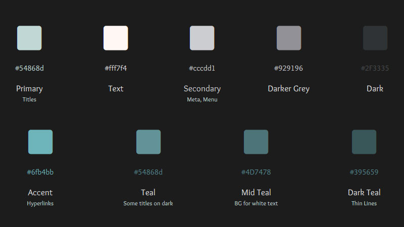
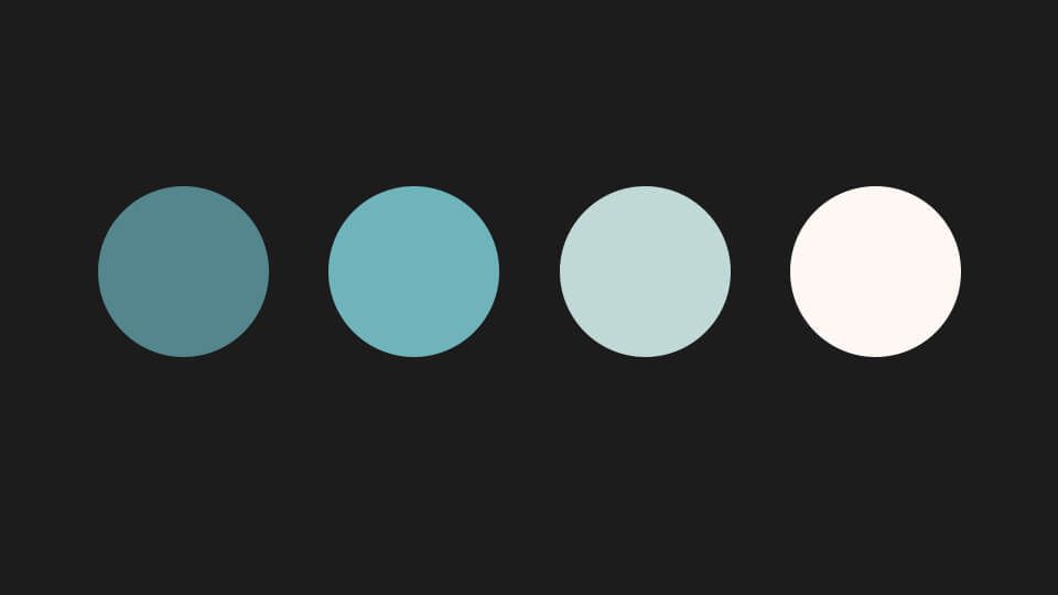
Colours
Background color: #1c1c1c
This was the original color palette, but I added some colors since.
H1: Head
H2: Headline
H3: Subtitle
H4: Subtitle
H5: Subtitle
H6: Subtitle
Added notes
Lorem ipsum dolor sit amet, consectetur adipiscing elit, sed do eiusmod tempor incididunt ut labore et dolore magna aliqua. Diam vulputate ut pharetra sit amet. Nam at lectus urna duis convallis convallis tellus id. Elementum curabitur vitae nunc sed velit dignissim sodales ut eu. Amet cursus sit amet dictum sit amet justo donec enim. Diam in arcu cursus euismod quis. Est velit egestas dui id ornare arcu odio ut. Molestie ac feugiat sed lectus vestibulum mattis ullamcorper. Sapien et ligula ullamcorper malesuada.
Table
Heading #1 | Heading #2 | Heading #3 |
|---|---|---|
Simple content | Simple content | Simple content |
Simple content | Simple content | Simple content |
Widgets
Accordion
Lorem ipsum dolor sit amet, consectetur adipiscing elit. Ut elit tellus, luctus nec ullamcorper mattis, pulvinar dapibus leo.
Lorem ipsum dolor sit amet, consectetur adipiscing elit. Ut elit tellus, luctus nec ullamcorper mattis, pulvinar dapibus leo.
Purposeful Animation
Each animation should have a clear reason, whether it’s to guide the user’s attention, indicate a transition, show cause-and-effect, or enhance the user interface’s overall aesthetic.
Guiding User Attention: Animations can direct users’ focus to specific areas or elements. For instance, a subtle bounce on a new message icon can draw the user’s attention, indicating where to look next.
Visual Feedback: They provide immediate feedback on user actions. For example, a button that changes color or depresses when clicked reassures the user that their action has been registered.
Indicating Status and Progress: Animations can show that something is happening. Progress bars or loading animations inform users that the system is processing their request, preventing confusion or impatience.
Enhancing Transitions: Instead of abrupt changes, animations can smooth transitions between different states or pages. This helps in maintaining continuity and context, making the experience less disorienting.
Teaching Through Interaction: They can guide users on how to use an interface. A swiping animation can indicate how to navigate through a carousel of images, teaching the interaction required.
Demonstrating Relationships: Animations can show how elements are related. For instance, expanding a dropdown menu from a button shows their connection.
Creating Spatial Awareness: By mimicking the physics of the real world, animations can create a sense of depth and spatial awareness in a predominantly flat digital space. For example, elements that slide in from off-screen can suggest off-screen space.
Adding Delight: When used judiciously, animations can make the experience more enjoyable, creating a memorable and positive impression of the brand or product.
Error and Confirmation Messages: Subtle animations can be used for displaying error messages or confirmations, making these messages stand out without being intrusive.
State Change Indicators: Animations can indicate a change in state, like toggling a switch or changing settings, making the interface intuitive.
Responsiveness
Animations should respond quickly to user interactions, creating a seamless experience that feels connected to their actions.
Immediate Feedback: Responsiveness means that the animation should start immediately following a user action. For example, when a user clicks a button, there should be no noticeable delay before the animation begins. This immediacy helps users feel more in control and assures them that the system has registered their input.
Fluidity: Animations should be smooth and fluid, without any choppiness or stuttering. Smooth animations contribute to a perception of a high-quality, well-designed application or website. Fluidity in animations is particularly important in touch-based interfaces, where users expect a direct and immediate correlation between their touch and the UI’s response.
Performance Optimization: To ensure responsiveness, animations must be optimized for performance. This means they should not slow down the application or website, consume excessive resources, or drain battery life on mobile devices. Optimized animations maintain a high frame rate (typically around 60 frames per second) to appear smooth and responsive.
Context-Aware Speed: The speed of the animation should be appropriate for its context. For instance, a quick animation might be suitable for a button press, whereas a slower animation might be better for page transitions. The key is to match the animation speed with the user’s expectations and the nature of the task.
Adaptive to User Input: Responsive animations adapt to the way users interact with the UI. For example, in a drag-and-drop interface, the movement of elements should match the user’s drag speed and direction. This kind of responsiveness makes the interaction feel more natural and intuitive.
Consistent Response Across Devices: Responsiveness also implies consistency across different devices and screen sizes. Animations should perform equally well on a desktop, tablet, or smartphone, providing a uniform experience regardless of the device used.
Avoiding Overloading with Animations: While animations can enhance the user experience, overusing them can have the opposite effect, making the interface feel sluggish or overwhelming. Responsiveness means using animations judiciously to maintain a balance between visual appeal and performance.
Fallbacks for Low-Performance Devices: For devices that cannot handle complex animations smoothly, it’s important to provide fallback options. This could mean simpler animations or no animations at all, ensuring that the user experience remains positive even on less capable hardware.
Timing and Duration
The timing should be just right—not too fast to miss, nor too slow to cause impatience. Usually, a duration between 200-500 milliseconds works well for most UI animations.
Optimal Duration: The duration of an animation should be long enough to be noticed but short enough to avoid delaying the user. Typically, a good range for UI animations is between 200 to 500 milliseconds. Shorter animations (around 200 ms) are typically used for subtle effects like button presses, while longer animations (up to 500 ms) can be reserved for more complex transitions.
Natural Motion: The duration should reflect how things move in the real world. Objects with more mass might move more slowly, so their animations should be longer to mimic this natural motion. This realism helps users intuitively understand the interface.
Context-Specific Duration: The ideal timing can vary depending on the context and the action. For example, opening a new page might warrant a slightly longer animation than hovering over a menu item. The key is to match the duration with the user’s expectations based on the action they’ve taken.
Avoiding User Frustration: If an animation is too slow, it can frustrate users who want to complete their tasks quickly. On the other hand, if it’s too fast, it might be missed entirely, failing to provide the necessary visual cues. The goal is to find a balance that maintains flow without causing delays.
Consistency: Consistent timing across similar actions is important. For instance, if all buttons have a similar hover effect, they should also share the same duration and easing for that effect. This consistency helps users learn the behavior of the UI, making it more intuitive.
Easing and Timing Functions: The way an animation accelerates and decelerates can significantly affect how its duration is perceived. Using easing functions (like ease-in, ease-out, or linear) can make animations feel more natural. For example, an ease-out function, where the animation starts quickly and then slows down, is often used for moving objects that come to a stop.
User Control and Preferences: In some cases, it might be beneficial to allow users to control the speed of animations, especially in accessibility settings. This can help accommodate users with different needs and preferences.
Testing and Iteration: Finding the perfect timing and duration often requires testing and iteration. It’s important to observe how real users interact with the animations and adjust the timing based on their feedback and behavior.
Easing and Motion Curves
Easing makes the motion more natural. Use acceleration and deceleration to mimic the physics of the real world. Tools like cubic-bezier curves help in refining these movements.
Simplicity and Clarity
The animation shouldn’t be overly complex or distracting. Its goal is to aid the user experience, not to overshadow the content or the primary function of the app/website.
Purpose Over Decoration: The primary goal of UI animations should be to improve the user’s understanding and interaction with the interface, not just to embellish it. Each animation should serve a clear, functional purpose, such as indicating a state change, providing feedback, or guiding attention.
Minimalism: The best animations are often subtle and understated. They should be just noticeable enough to guide or inform the user without overwhelming or distracting them from their primary task. This minimalist approach aligns with the modern design principle of ‘less is more’.
Clarity in Communication: Animations should communicate a message or guide the user in a clear and unambiguous way. For instance, a loading spinner clearly indicates that the system is processing, while a shaking motion on a text field can indicate an input error.
Avoiding Overuse: Overusing animations can lead to a cluttered and confusing interface. It’s important to use them sparingly and only where they add value. Too many movements on the screen can be distracting and even annoying to users.
Consistency: Consistent animations across the UI help in building user intuition and understanding. For example, if a right swipe always means ‘go to the next item’, this should be consistent throughout the application.
Intuitive Transitions: Transitions between different states or pages should be smooth and logical. The animation should make sense in the context of the transition, helping the user to understand how different parts of the application are connected.
Respecting User Focus: Animations should not disrupt the user’s focus, especially during critical tasks. Animations used in areas of secondary importance should be more subdued to not draw attention away from the primary content or action.
Performance Considerations: Keeping animations simple also means they are more likely to perform well across different devices and platforms, including those with less processing power. This ensures a smooth and consistent experience for all users.
Cultural and Contextual Appropriateness: The clarity of an animation can also be influenced by cultural and contextual factors. What is clear and intuitive in one culture or context might not be so in another. It’s important to consider the target audience and their potential interpretations of visual cues.
Testing with Real Users: Finally, testing animations with real users is crucial. What might seem simple and clear to a designer or developer might not be so for the end user. User testing can provide valuable insights into how animations are perceived and interacted with.
Consistency
The animations throughout the app or website should be consistent in style and behavior, reinforcing the overall design language and brand identity.
Feedback
Use animations to provide feedback in response to user actions. For example, a button changing appearance when clicked confirms the action has been registered.
Hierarchy and Attention
Guide the user’s focus through animations, highlighting important elements or indicating the sequence of actions.
Visual Hierarchy Through Animation: Animation can be used to establish or reinforce the visual hierarchy of elements on a screen. Important elements, like primary calls to action (CTAs), can be animated to draw more attention than secondary elements. For example, a subtly pulsating ‘Sign Up’ button catches the eye more effectively than a static one.
Guiding User Focus: Animations can guide users through a series of steps or draw their attention to new or important information. For instance, when a user completes a step in a process, an animation can gently lead their eyes to the next step, ensuring a smooth user flow.
Highlighting Changes: If something changes in the UI, like a new message or notification, an animation can highlight this change without being disruptive. A small badge with a pop-in animation can effectively indicate new activity.
Sequential Attention: For complex interfaces, animations can be used to reveal elements in a sequence, rather than all at once, to help users process information in a manageable order. This sequential revealing can ease the cognitive load on users.
Interactive Elements: Animations can indicate which elements are interactive. For example, a slight bounce or enlargement of an icon when hovered over can indicate that it’s clickable, helping users understand how to navigate the interface.
Contextual Emphasis: In data visualization or dashboards, animations can be used to emphasize specific data points or changes in data over time, directing the user’s attention to the most significant or relevant information.
Temporal Hierarchy: Animations can also establish a temporal hierarchy. For example, primary information can be presented first with a quick animation, followed by secondary information with a slower or more subtle animation.
Focus on Active Elements: In forms or multi-step processes, the current or active field can be highlighted with a subtle animation, helping the user to understand where they are in the process and what requires their attention.
Minimizing Overwhelm: It’s crucial to use animations to focus attention without overwhelming the user. This means not everything should be animated at once, and the animations themselves should be subtle and well-timed.
Accessibility Considerations: It’s important to consider users who may be sensitive to motion or have attention-related disorders. Providing options to reduce motion or turn off animations can make the UI more accessible to a broader audience.
Accessibility
Ensure animations don’t cause issues for users with sensitivities or disabilities. Provide options to reduce or remove animations if necessary.
Performance
Ensure that animations are optimized for performance, not causing delays or jitters, especially on lower-end devices.
Archive


Video playlist
Playlist

1:18:55

1:04:13

")