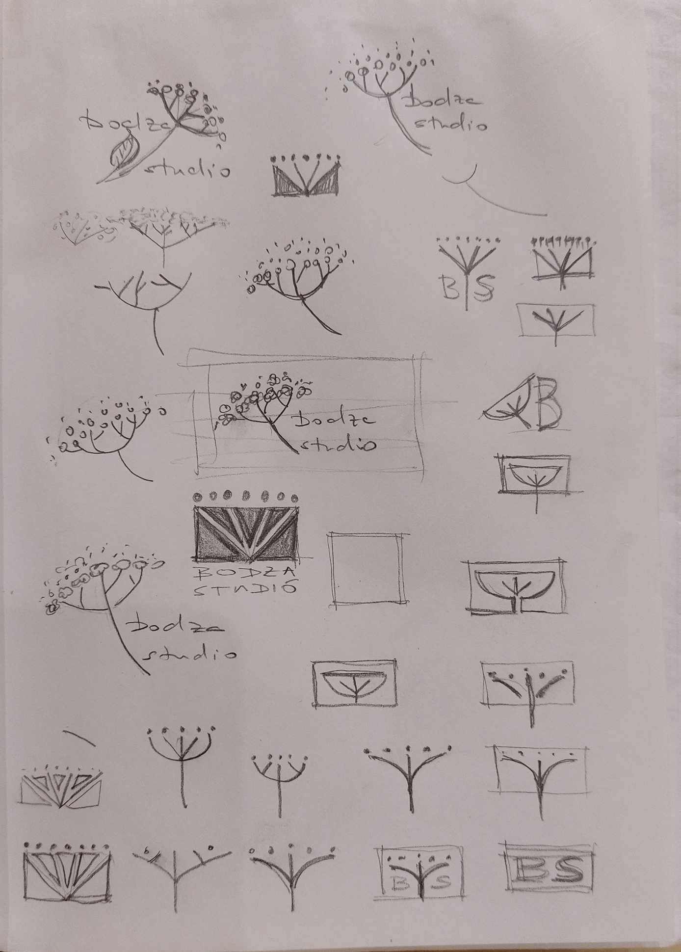
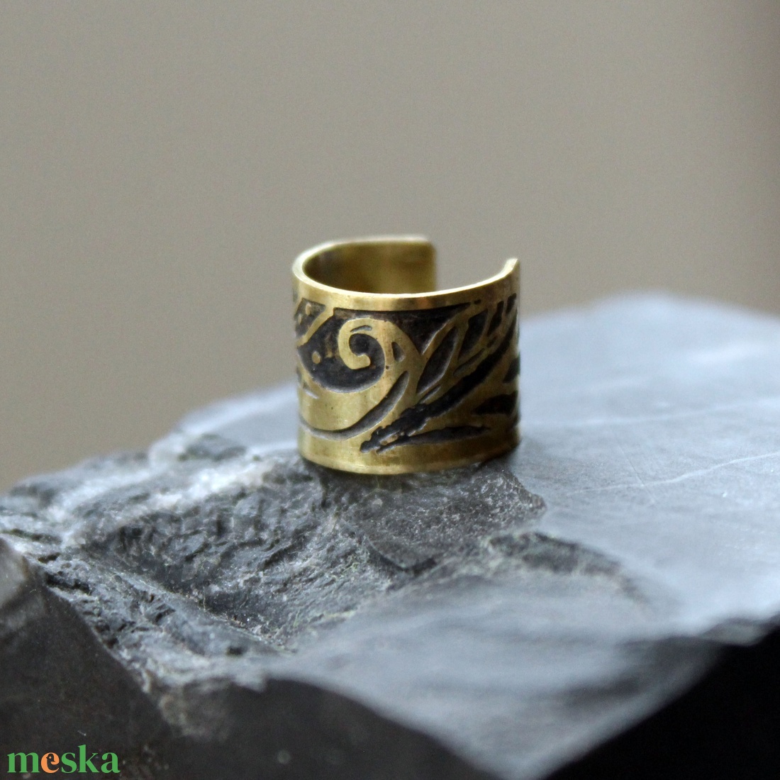
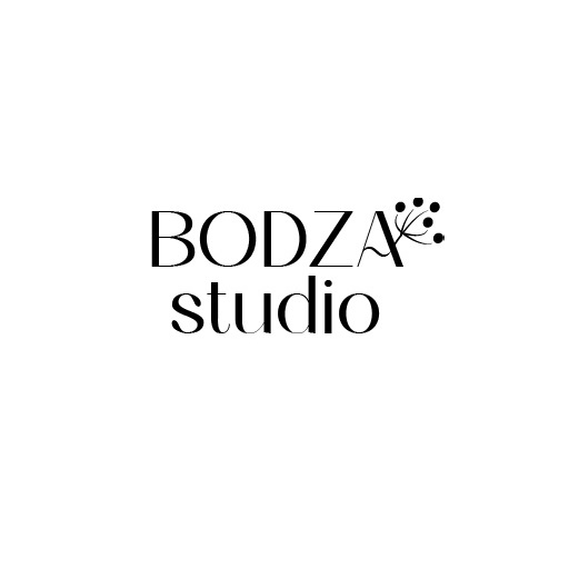
A dear friend’s friend asked me to create a logo for her jewellery store, named after the elderberry. She had a few designs, but she was stuck at some point. She showed me her jewellery store and my favourite styles, art nouveau and art deco came to my mind.
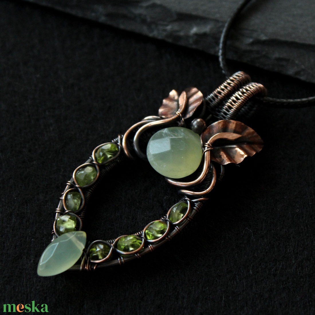
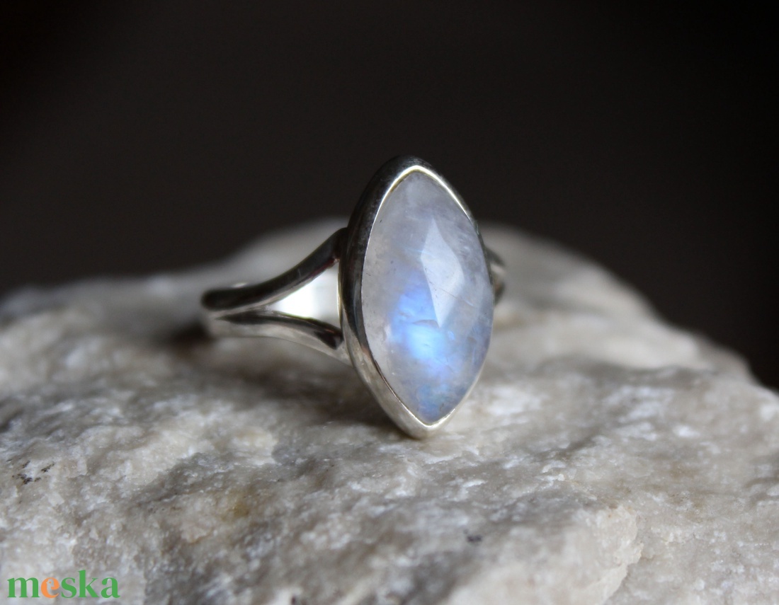
Samples of her jewellery and her preliminary designs:
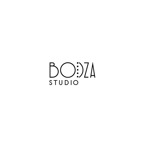
My first version was a curvier, more art nouveau style logo, but I wasn’t sure if the style suits her taste. I did like the direction and showed it to her.
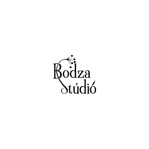
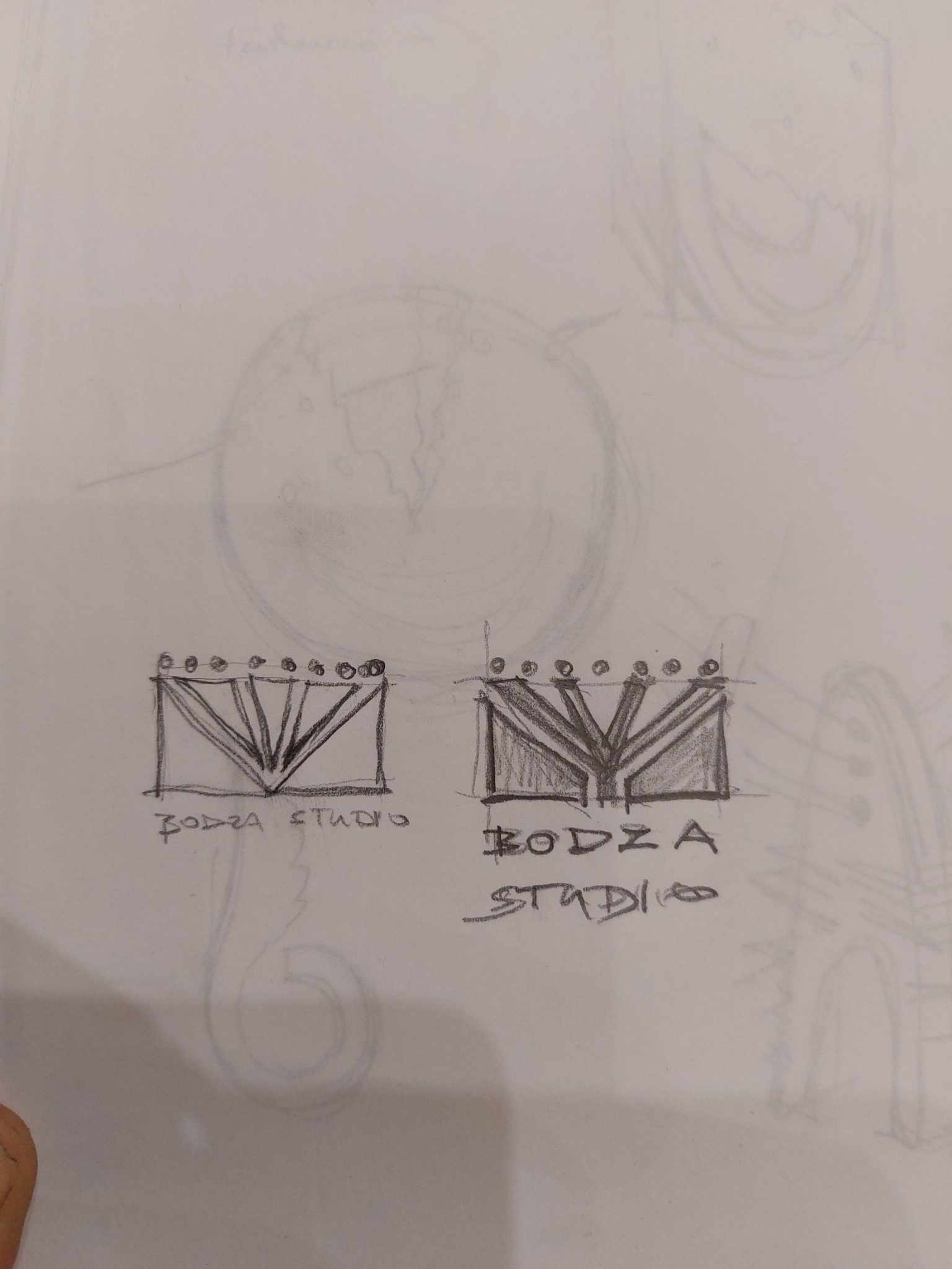
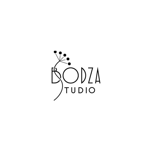
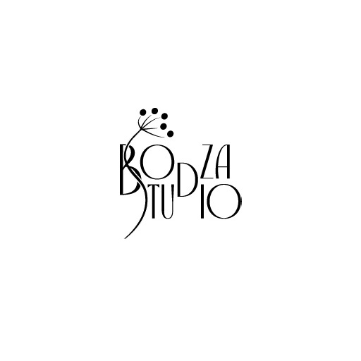
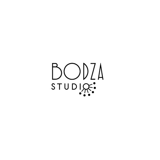
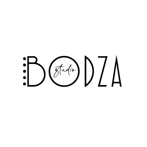
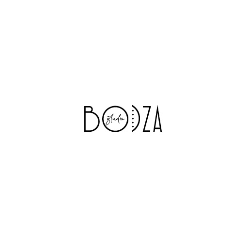
She found it sweet, but she confirmed that she would prefer a sans serif, more modern font. I presented a few variations and we both prefered the very geometric art deco font, and the S curving through the B, even if it is a bit risky, losing the legibility of “studio” a bit.
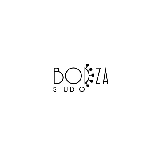
She created mockups to help her decide between the two finalists, which was a great idea, and she explained she really thought the second was sleek, creative, smart, but she still felt she was still more attached to the first version. I guess the legibility would be an issue if “studio” wasn’t a well known word, but because it is so general, maybe the playfulness with the S makes the logo a bit more interesting this way.
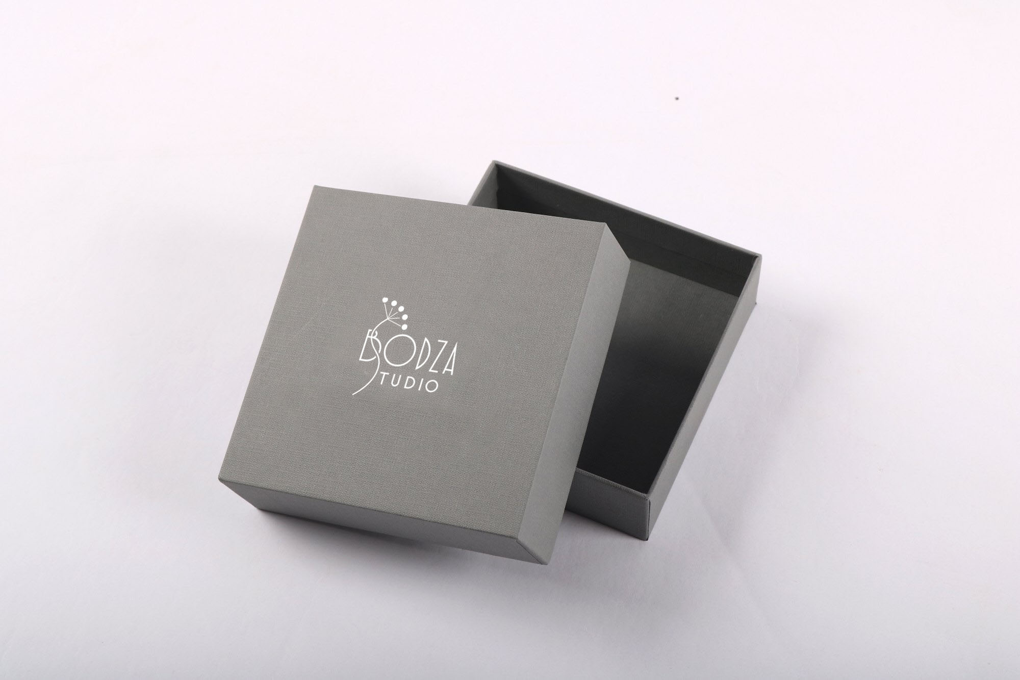
The final decision fell on this version, and I am excited to see it on her webstore and packaging designs!