My own website

The idea of my own website has been nagging me for quite a while, but the idea (and my skills) needed to mature.

The website is partially a portfolio, but  I do aim to keep useful tutorials, archive or link interesting /relevant articles and use it for experimenting and hobby projects as well. Visually I aimed to create a playful, but more traditional look, trying to integrate my father’s artful influence into my works.

Connecting with my father

Choosing my father’s iconic painting about me warms my heart, as his humourous, naive and still, all knowing style did have a great effect on my attitude to life. This picture is close to me ever since its creation and it makes me smile every time I look at it. I have been using it on several sites as a profile picture for many years now, so it made sense to display it in the header.

Choosing the fonts

Beside the picture, I knew I wanted a classic for the title font as I am a devoted fan of traditional typography: Cormorant is carefully designed, modern and traditional at the same time: delicate widths of line, countless variations to play with: a treat to the eye.

Cormorant’s google page and behance page.

A relaxed, dynamic handwritten font, Bird and Thorn is used as an underlay to loosen the design and I chose to scatter the Cormorant letters playfully as well: a little imperfection, some irregularity making it come alive. 

I like the lightness of being a little random and unconventional, but not at the cost of total chaos if I can help it: the same need that is reflected in the irregular leaves of the fern and the tilted design.

The tilted letting is fun, but it looked boring unless I used at least one line in the conventional horizontal way as a reference point to put the eye to rest. I like it how the fern’s spiraling end leads the eye and frames it too.

Including nature

I knew from the start that I wanted something organic to represent my love of nature.

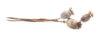
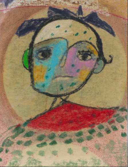
First I chose the poppy as that is also an unconventional beauty, something that I hope my works would grow into as  I mature into the designer I wish to be. It is also something that connects me with my parents as they taught me the appreciation of nature and always had some dried flowers or grasses in vases around in the house. On top of all this, I love any food with poppy seeds.

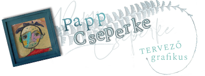
But then I found the fern at one of my favourite resource locations, the Biodiversity Heritage Library on Flickr,  which is an irresistably beautiful graphic element with the leaf repetitions along such an elegant curve.

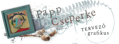
The random irregularities in the leaf also reflect my own way of thinking. Nature is the awesomest designer and I would love to celebrate it in all my future works if possible.

However, these two organic elements seemed a bit too much together and I decided to lose the poppy and also the watercolour background in the end. The fern is a complex element to look at, and the rest feels like a distraction when they are together, an overcrowded design.

I also decided to experiment with a dark background and I liked the result, especially when I finalized the colours, realizing that the colourful picture contrasts better with a more monochrome title, but I still played with contrast in the title as well:

I am entirely satisfied with the final version and it did inspire a color palette I am very happy to use throughout the site.

Getting inspiration from my father’s paintings is a labour of true love and so much fun ♥.

Site Typography:

Body text is Overlock, a playful award winning font that uses the impression of the sewing technique.

A light blue contrasting the background is used for links.

Heading 1

Heading 2

Heading 3

Heading 4

Heading 5
Heading 6
 
 
Note: I created an irregular set of round corners for the buttons and inlaid containers to add to the playfulness of the design.
en_GB