

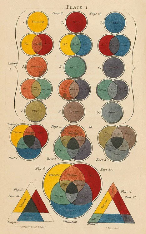
Complementary colors
Complementary colors are pairs of colors that, when combined, create a neutral gray or white color. They are located opposite each other on the color wheel, and their juxtaposition creates a dynamic contrast that enhances each other's intensity and impact. Complementary colors provide a powerful tool for designers to create visually striking and harmonious compositions. Some common examples of complementary pairs include red and green, blue and orange, and yellow and purple.
Analogous Colors
Analogous colors are groups of colors that sit adjacent to each other on the color wheel. They share a primary hue and have similar tones, creating a harmonious and soothing effect. For example, a group of analogous colors might include various shades of blue, such as navy, sky blue, and teal.
Monochromatic Colors
Monochromatic color schemes consist of various shades, tints, and tones of a single color. This creates a subtle and cohesive look, as the colors are derived from the same base hue but differ in lightness and saturation.
Playlist

41:27

4:39